Office accessibility features and screen reader compatibility are no longer optional extras — they are a baseline expectation for any professional document. Whether you are drafting a Word report, building an Excel dashboard, or presenting slides in PowerPoint, making those files WCAG-compliant means every colleague, client, or student can engage with your content equally. This guide walks you through the practical steps to achieve that across all three core Office applications.
Why WCAG Compliance Matters for Office Documents
The Web Content Accessibility Guidelines (WCAG) 2.1, published by the W3C, set out four core principles: content must be Perceivable, Operable, Understandable, and Robust. While WCAG was originally designed for web pages, its principles map directly onto Office documents — especially when those files are published online, converted to PDF, or opened in a browser-based viewer. In many jurisdictions, public-sector bodies and larger organisations are legally required to meet at least WCAG 2.1 Level AA, and enforcement is increasing year on year.
Beyond compliance, there is a plain human case. Approximately 1 in 6 people globally lives with some form of disability, according to World Health Organisation estimates. Screen readers, refreshable braille displays, and keyboard-only navigation are daily tools for millions of users — and a poorly structured Word file or unlabelled chart can make a document completely unusable for them.
The Built-In Accessibility Checker: Your First Line of Defence
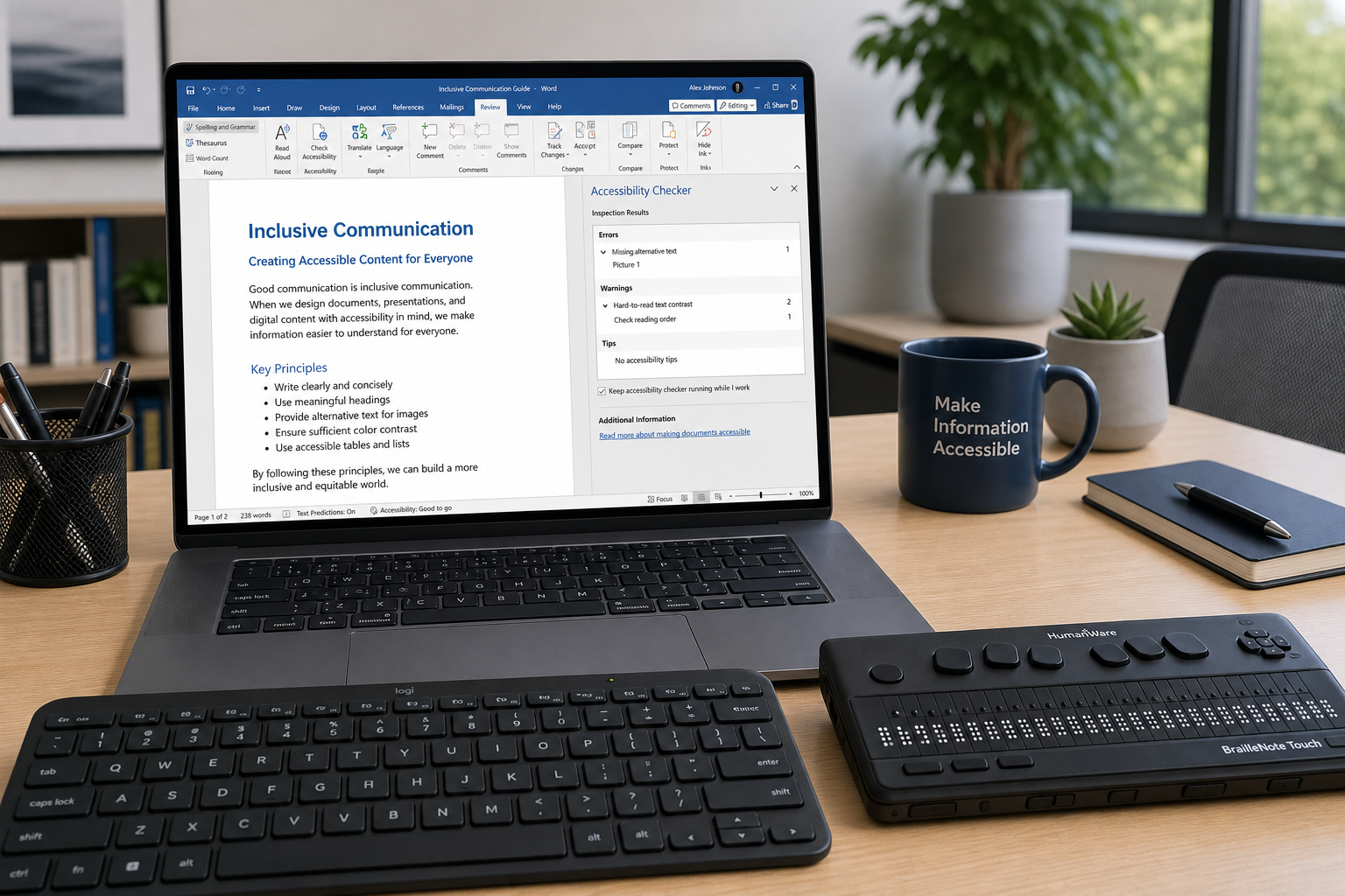
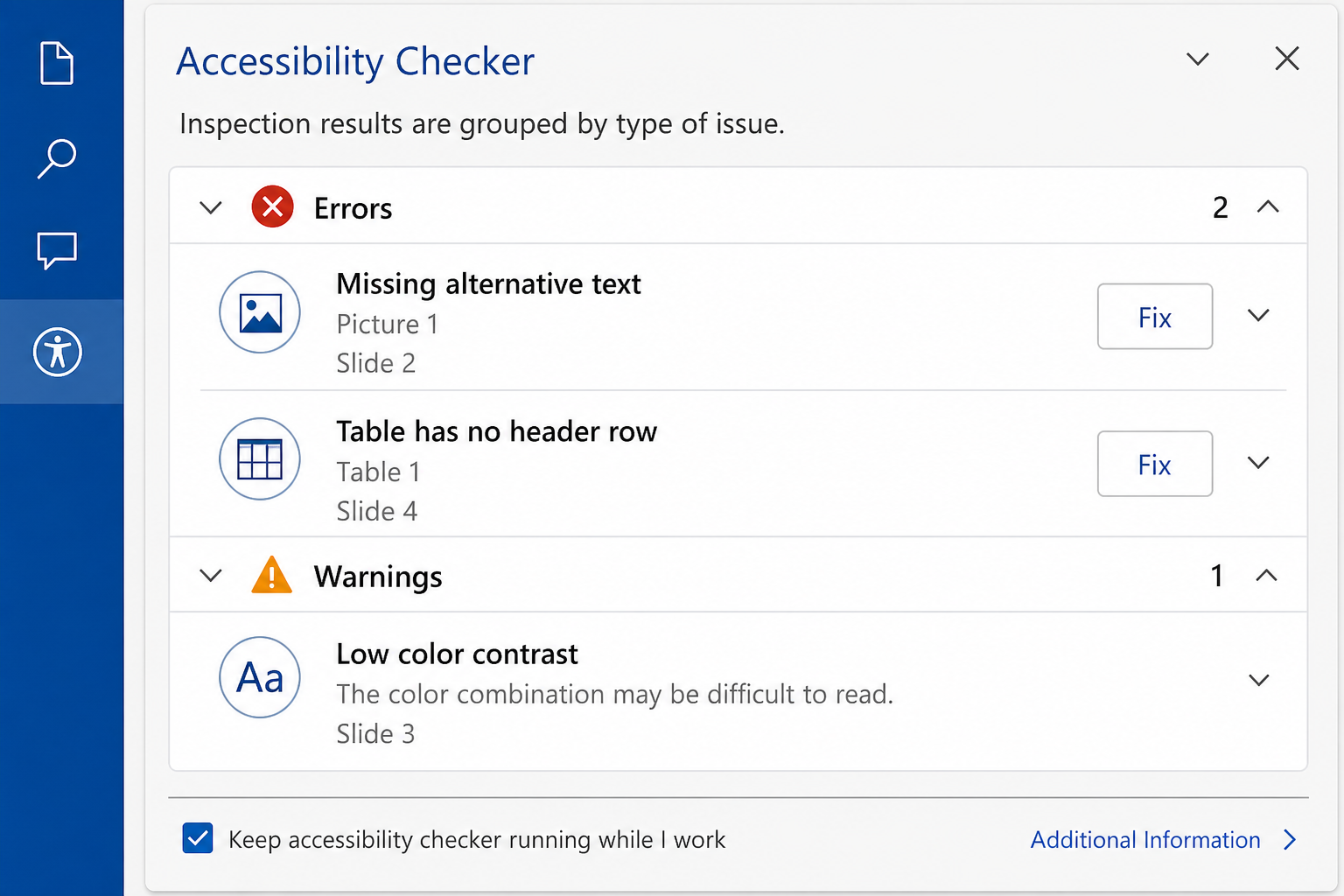
Microsoft Office includes a built-in Accessibility Checker in Word, Excel, and PowerPoint that flags issues before you share a file. Run it at any time by going to Review → Check Accessibility. The panel categorises findings as Errors, Warnings, and Tips — with specific guidance on how to fix each one.
- Errors — content that is very difficult or impossible for assistive technology to read (e.g. images without alt text).
- Warnings — content that may be difficult for some users (e.g. tables with merged cells).
- Tips — recommendations that improve the overall reading experience (e.g. adding a document title in File Properties).
Running the Accessibility Checker takes under a minute and is the single fastest way to catch the most common screen reader compatibility issues before they reach your audience.
Office Accessibility Features in Microsoft Word

Word is the most widely used document format in professional environments, which makes its office accessibility features especially important to get right.
Use Built-In Heading Styles
Screen readers navigate documents by jumping between headings using keyboard shortcuts. If you manually bold and enlarge text instead of applying Word’s built-in Heading 1, Heading 2, and Heading 3 styles, screen reader users have no way to skip between sections. Apply heading styles via the Home → Styles gallery — every heading you style correctly is a navigational landmark for assistive technology.
Add Meaningful Alt Text to Every Image
Right-click any image, chart, or SmartArt graphic and select Edit Alt Text. Write a concise description of what the image conveys — not just what it shows. A chart showing quarterly sales growth should have alt text like “Bar chart: Q1-Q4 revenue grew from €120k to €310k.” If an image is purely decorative, tick the “Mark as decorative” checkbox so screen readers skip it entirely.
Use Descriptive Hyperlink Text
Screen reader users often pull up a list of all hyperlinks in a document. If every link reads “click here” or “read more,” that list is meaningless. Write anchor text that describes the destination — “Download the Office 2024 Pro Plus activation guide” tells the reader exactly where the link goes.
Avoid Text Boxes and Floating Objects
Text boxes are read out of document order by most screen readers. Wherever possible, keep text inline. If you need a call-out, use a bordered table cell instead — these are handled reliably by screen readers.
Screen Reader Compatibility in Microsoft Excel
Spreadsheets present unique challenges for screen reader compatibility because data meaning depends heavily on context — column headers, row labels, and cell relationships are all invisible to assistive technology unless you explicitly define them.
Name Every Sheet and Avoid Blank Rows
Default sheet names like “Sheet1” tell a screen reader nothing. Rename every tab to describe its content. Also avoid blank rows and blank columns within data ranges — screen readers interpret these as the end of a table, cutting off data that follows.
Define Tables Using the Format as Table Feature
Select your data range and go to Home → Format as Table. This tells Excel — and any assistive technology reading the file — that the first row contains column headers. Screen readers can then announce the column header alongside each cell value as a user navigates, making data comprehensible without sight.
Add Alt Text to Charts and Visuals
Right-click any chart and choose Edit Alt Text. Describe the key insight the chart communicates, not just its type. Excel charts embedded with no alt text are entirely silent to screen readers — the visual data might as well not exist for those users.
Use Colour Plus a Secondary Indicator
WCAG 2.1 Success Criterion 1.4.1 states that colour must not be the only means of conveying information. If you use red cells for overdue tasks and green for completed, add a text label (e.g. “Overdue” or “Done”) or a pattern fill as well, so colour-blind users and those using high-contrast modes receive the same information.
WCAG Compliance Office Tips for PowerPoint

WCAG compliance in Office presentations often receives less attention than Word documents, yet PowerPoint files are shared widely — in emails, on websites, and via learning management systems — where screen reader compatibility matters enormously.
Set a Logical Reading Order for Every Slide
Screen readers read slide objects in the order they appear in the Selection Pane, not necessarily the visual order on the slide. Open the Selection Pane via Home → Arrange → Selection Pane and drag objects into the correct reading sequence — title first, then body text, then any supporting images.
Use Built-In Slide Layouts, Not Blank Slides
PowerPoint’s built-in slide layouts contain pre-defined content placeholders that are recognised by screen readers as slide titles and body text. A blank slide with manually placed text boxes gives assistive technology no structural cues whatsoever. Choosing a layout from the New Slide dropdown takes seconds and makes a significant difference to screen reader compatibility.
Ensure Sufficient Colour Contrast
WCAG 2.1 Level AA requires a contrast ratio of at least 4.5:1 for normal text and 3:1 for large text. Many standard PowerPoint themes fall short of this, especially when text is placed over photographic backgrounds. Use a free contrast checker such as the one built into Microsoft’s Accessibility Insights tool to verify every slide.
Caption Videos and Audio Content
PowerPoint supports closed captions for inserted video files. If your presentation includes narration or video, add captions or a text transcript. This addresses WCAG 2.1 Success Criterion 1.2 (Time-Based Media) and makes your content accessible to deaf and hard-of-hearing audiences as well as users in noise-sensitive environments.
Office Accessibility Features: Quick-Reference Checklist
Use this checklist across all three applications before sharing or publishing any document:
- Run the built-in Accessibility Checker and fix all Errors and Warnings.
- Apply built-in heading styles (Word) or table formatting (Excel) rather than manual formatting.
- Add descriptive alt text to every meaningful image, chart, and SmartArt.
- Write descriptive hyperlink anchor text — never “click here.”
- Ensure colour is never the sole indicator of meaning.
- Verify text contrast ratios meet WCAG 2.1 AA minimums (4.5:1 for body text).
- Set a logical reading order in PowerPoint’s Selection Pane.
- Name all Excel sheets descriptively and format data ranges as tables.
- Add captions or transcripts to any embedded media.
- Set the document language via File → Options → Language so screen readers use the correct voice and pronunciation rules.
Choosing the Right Version of Office for Accessibility Work
The office accessibility features described in this guide are available from Office 2019 onwards, with the most complete implementation in Office 2021 and Office 2024. Office 2024 Pro Plus, in particular, introduced an improved Accessibility Checker with richer explanations and more actionable fix suggestions — a meaningful upgrade for teams with a dedicated accessibility workflow.
If you are looking for a cost-effective way to get a fully licensed version of Office, Shop Key Online offers Microsoft Office 2021 Professional Plus for Windows from €19.15, and Microsoft Office 2024 Pro Plus for Windows from €24.50 — both with instant email delivery and a 100% money-back guarantee if activation fails. Either version gives you all the tools you need to create fully accessible, screen-reader-ready documents from day one.
FAQ: Office Accessibility Features & Screen Reader Compatibility
What is the difference between WCAG 2.1 Level A and Level AA for Office documents?
Level A covers the most fundamental accessibility requirements — things like providing alt text for images and not relying on colour alone to convey meaning. Level AA builds on this with stricter contrast ratios (4.5:1 for normal text) and additional requirements such as captions for live audio. Most legal frameworks and organisational policies require at least Level AA compliance, so that is the target to aim for in your Office documents.
Which screen readers work best with Microsoft Office?
JAWS (Job Access With Speech) and NVDA (NonVisual Desktop Access) are the two most widely used screen readers on Windows, and both have deep integrations with Microsoft Office. Microsoft’s own Narrator is built into Windows and works reliably with Word, Excel, and PowerPoint. On Mac, VoiceOver pairs well with the Mac versions of Office. For best results, test your documents with at least one of these tools before distributing them widely.
Do I need to make documents accessible if I only share them internally?
Yes. Any colleague who uses assistive technology needs the same access to internal reports and spreadsheets as everyone else. Beyond the ethical case, many organisations have internal accessibility policies that mirror or exceed WCAG 2.1 AA requirements. Building accessible habits into your everyday document creation is far more efficient than retrofitting accessibility later.
How do I check colour contrast in Office without a separate tool?
The Accessibility Checker in Office 2021 and 2024 flags insufficient colour contrast as a Warning. You can also use the free Microsoft Accessibility Insights browser extension, which includes a contrast analyser. For precise WCAG 2.1 AA ratios, paste your hex colour codes into the online WebAIM Contrast Checker for an instant pass/fail result.
Does saving as PDF preserve Office accessibility features?
When you export a Word, Excel, or PowerPoint file to PDF via File → Save As → PDF, tick the option “Document structure tags for accessibility” in the Options dialog. This embeds the heading structure, alt text, and reading order into the PDF so screen readers can access them. Simply printing to a PDF printer does not carry over any accessibility data.